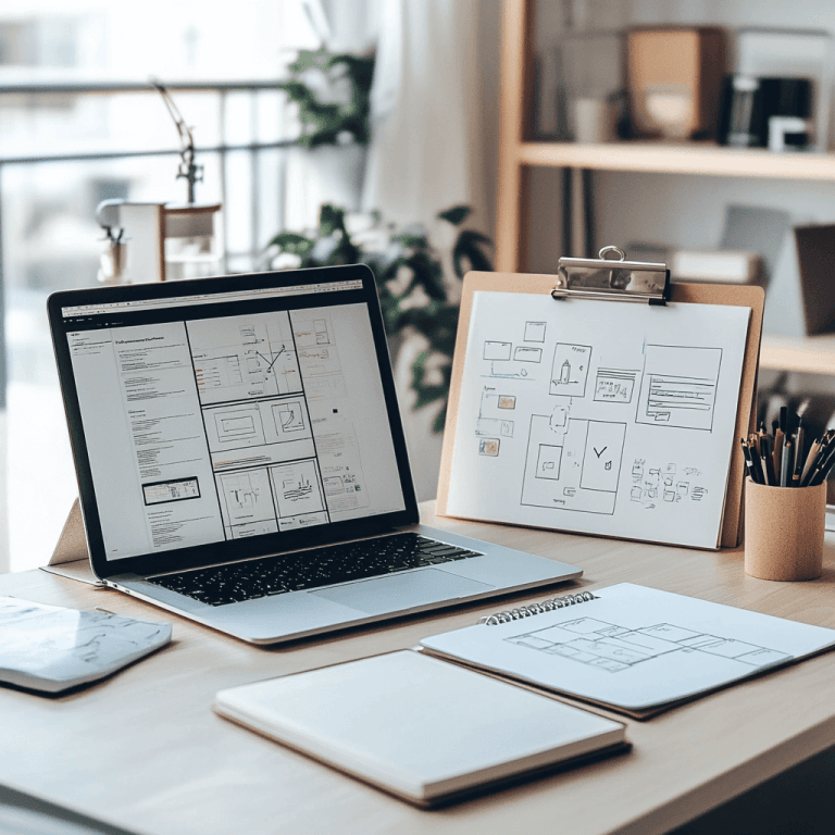
A website isn’t just a digital business card. It’s your most powerful marketing asset, open 24/7, and often the first place your customers interact with your brand. But, while having a beautiful website is important, it doesn’t always equate to having an effective one.
An effective website goes beyond aesthetics. It’s built on smart design choices, psychological insights, and visual storytelling that together influence user behavior. In this post, we’ll break down the elements that make websites effective at driving sales and conversions.
First Impressions: The Power of Visual Psychology
It takes about 50 milliseconds (that’s 0.05 seconds) for users to form an opinion about your website. In that split second, they’re deciding whether to stay or leave.
Here are some visual cues that make a first impression, even if we may not realize it:
- Color psychology in web design – Colors evoke emotions. Blues communicate trust, greens suggest growth, and bold reds create urgency.
- Whitespace for usability – Empty space helps users focus, reduces clutter, and highlights CTAs (Call to Action).
- Visual hierarchy in layout – Headlines, contrast, and size guide the eye and ensure key messages aren’t missed.
💡 Psychology Tip: The Von Restorff Effect (also known as the “Isolation Effect”) says that elements that stand out are more likely to be remembered. This is why high-contrast buttons work so well.
Clear Purpose and Value Proposition
Your homepage should answer three key questions immediately:
- What is this website about?
- What value does it offer me?
- What action should I take next?
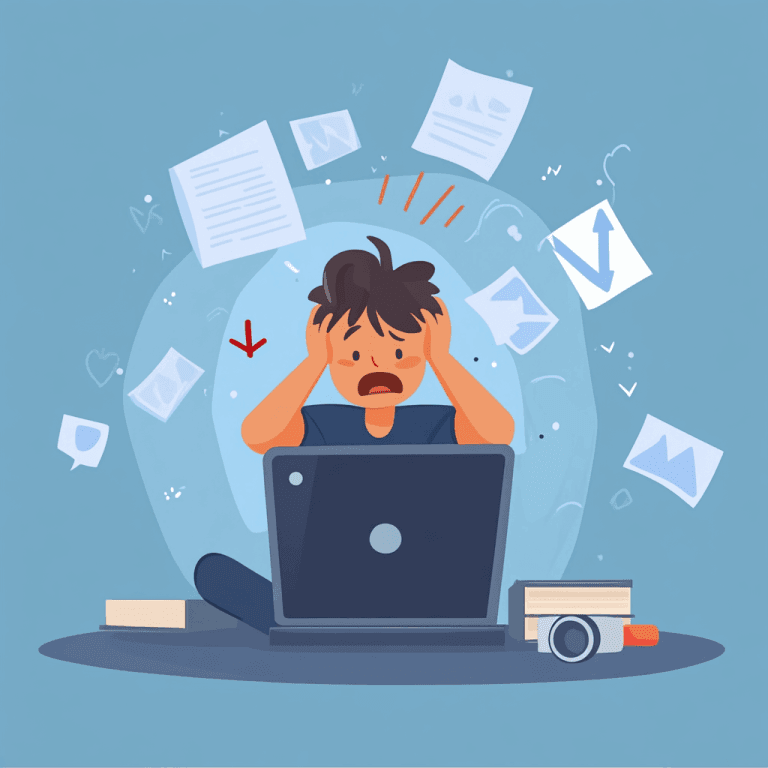
If visitors can’t answer those questions fast, they’ll bounce (a high bounce rate doesn’t look good in the eyes of a search engine algorithm), no matter how modern the design looks.
Here is an example headline that answers these questions: “All-in-One Marketing for Local Businesses – Start attracting more customers in under 7 days.”
💡 Psychology Tip: The “Cognitive Load Theory” shows that when people are faced with too much information at once, they shut down. Keep your value proposition clear and simple to reduce mental effort.
Strategic Use of Imagery and Icons
Visuals are processed 60,000 times faster than text, making them essential to quick comprehension and emotional impact.
- Authentic images – Whenever possible, skip generic stock photos. Real, high-quality images connect with users and make your business seem more trustworthy and experienced.
- Icons for clarity – Icons simplify complex concepts and speed up understanding.
- Video content – Explainer videos or product demos increase engagement and can boost conversions by 80%.
💡 Psychology Tip: Faces in images naturally draw attention. Use them in testimonials or product use cases to increase trust.
Trust-Building Design
No conversion happens without trust. A well-designed website should reassure visitors at every step.
- Testimonials and case studies – Social proof builds credibility.
- Client logos and partnerships – Signals reliability instantly.
- Awards and certifications – External validation increases confidence.
- Transparent contact info – Easy-to-find details show you’re a real business.
💡 Psychology Tip: The Bandwagon Effect means people follow the crowd. Highlight stats like “Trusted by 2,000+ businesses worldwide.”
Fast Load Times and Mobile Responsiveness
Speed and accessibility are silent deal-breakers. A slow, unresponsive site kills conversions.
- Website speed optimization – Compress images, clean up code, and enable caching.
- Mobile design in mind – Over 60% of web traffic is on mobile devices, meaning that your site must look great on any screen size.
- Cross-browser testing – Guarantee consistent experiences everywhere.
💡 Psychology Tip: Users subconsciously link speed with professionalism. Fast sites feel more trustworthy. The “Expectation Gap” effect means users expect sites to load in under 3 seconds. If they wait longer, frustration rises, and trust drops.
Accessible and Inclusive Design
An effective website is one everyone can use. This includes tools to support users with visual, motor, or cognitive disabilities. Accessible and inclusive sites also widen your audience reach.
- Readable typography – High contrast, large enough font size.
- Alt text for SEO + accessibility – Describes images for screen readers and boosts rankings.
- Keyboard navigation – Ensures usability for those with mobility challenges.
- Logical page structure – Clear headings improve navigation and SEO.
💡 Psychology Tip: Readable typography, logical page structure, and keyboard navigation reduce friction for all users. When navigation feels natural, users are more likely to stay engaged and return.
Clear, Action-Oriented CTAs
A strong CTA tells the user exactly what to do next, no guesswork.
Some examples:
- “Get Your Free Website Audit”
- “Book a Discovery Call”
- “Start My Free Trial”
Strategies to keep in mind:
- Use action-driven language
- Keep CTAs benefit-focused
- Place multiple CTAs throughout the page, not just at the end
💡 Psychology Tip: The “Zeigarnik Effect” shows people remember incomplete tasks better than completed ones. A well-placed CTA taps into this, encouraging users to take the next step to “close the loop.”
Make Psychology Work for Your Website
At the end of the day, your website isn’t just code and pixels, it’s human psychology in action. And a truly effective website blends user psychology together with visual storytelling and timeless design principles. Every color, word, and design choice shapes how visitors feel, think, and decide. When those elements are aligned with your business goals, your site stops being just “a presence online” and becomes your most reliable growth engine.
Whether you’re planning a redesign or launching something new, keep your users’ needs and instincts at the center of your process.
Ready to build a website that doesn’t just look good, but truly converts?
Let’s create a digital experience designed around the way your customers think and act, and turn your site into your best-performing sales tool.